The task of figuring out the short-term direction of any financial asset can seem daunting, especially when traders try looking at the chart of the asset's price for guidance. Looking at the day-to-day price fluctuations seen on a chart can seem choppy and can make it extremely difficult to determine which price movements are important and will significantly affect the direction of the security.
| |
Kagi Chart Construction
Kagi charts consist of a series of vertical lines that depend on price action, rather than on time like the common charts such as line, bar or candlestick. As you can see from the chart below, the first thing that traders will notice is that the lines on a kagi chart vary in thickness depending on what the price of the asset is doing. Sometimes the lines are thin, while at other times the lines will be thick and bolded. The varying thickness of the lines and their direction is the most important aspect of a kagi chart because this is what traders use to generate transaction signals. (For related reading, see Analyzing Chart Patterns.)
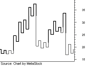 |
| Figure 1 |
Kagis and Candlesticks
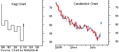
The different lines on a kagi chart may seem overwhelming at first glance so let's walk through an example of Apple Computer Inc. (AAPL) between May 8 and December 1, 2006. We believe that this example will make it much easier to fully understand how this interesting type of chart is created. We've also attached a regular candlestick chart to several of the kagi charts to illustrate what the price of the underlying asset has done to cause a certain change to the kagi chart.
As you can see in Figure 2, the price of AAPL shares started to decline shortly after the start date of our chart. As the price fell, a vertical line was created, and the bottom of this vertical line was equal to the lowest closing price. If the next period's close were to be lower than the current bottom on the line, then the line would be extended to equal the new low. The line will not change directions until the price moves above the bottom of the kagi line by more than a preset reversal amount, which is usually set at 4%, although this parameter can change depending on the security or trader's preference.
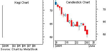 |
| Figure 2 |
The Reversal
On June 1, 2006, AAPL shares closed above the kagi low by 4.02% - more than the 4% reversal amount needed to change the direction of the chart (4%). As you can see from the chart below, the reversal is shown by a small horizontal line to the right followed by a vertical line in the direction of the reversal. The rising Kagi line will remain in the upward direction until it falls below the high by more than 4%.
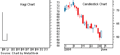 |
| Figure 3 |
The reversal was welcomed by many traders because this was the first bullish kagi signal that was generated since the chart was created in early May. However, unfortunately for the bulls, the move was unsustainable as the bears responded and pushed the price below the high of the Kagi line by more than the reversal amount of 4%. The downward reversal is shown on the chart as another horizontal line to the right followed by a line moving in the downward direction.
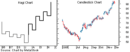
As you can see from Figure 4 below, the bulls and bears spent the following few weeks fighting over the direction of Apple shares, causing the kagi chart to reverse directions several times. Three of the moves higher that occurred between June and July were greater than 4% above the chart's low, which caused the kagi chart to reverse directions. These moves represented an increasingly bullish sentiment, but they were not strong enough to fully reverse the trend. (To learn more, read Retracement Or Reversal: Know The Difference and Support And Resistance Reversals.)
 |
| Figure 4 |
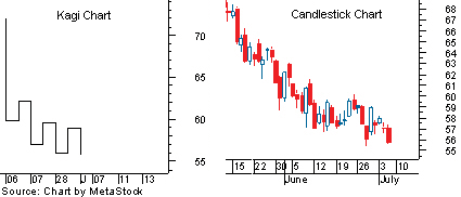
The Thick Line
The number of false reversals started to show traders that bullish interest in the stock was increasing, but that the true trend remained in the bears' control. This story changed on July 20, 2006, because of a gap that was substantially greater than the 4% needed to reverse the chart's direction. In fact, the gain was large enough to send the price above the previous high drawn on the kagi chart, shown by the most recent horizontal line drawn near $57.40. A move above a previous Kagi high like the one shown in the figure below causes the line of the kagi chart to become bold.
 |
| Figure 5 |
A shift from a thin line to a bolded line, or vice versa, is used by traders to generate transaction signals. Buy signals are generated when the kagi line rises above the previous high, turning from thin to thick. Sell signals are generated when the kagi line falls below the previous low and the line turns from thick to thin. As you can see in Figure 6, the Kagi chart reversed directions after the sharp run up, but a simple reversal does not change the thickness of the line or create a transaction signal. In this example, the bears were unable to send the price below the previous low on the kagi chart.
|
When the bullish momentum continued again in mid August, the price shifted back in the upward direction, creating a new swing low that will be used to create future sell signals. Ultimately, the bulls were unable to push the price of Apple shares back below the low, causing the kagi chart to remain in a bullish state for the remainder of the tested period. The lack of a sell signal enabled traders to benefit from the strong uptrend without being taken out by random price fluctuations.
 |
| Figure 6 |
Longer-Term Example
Now that we have an understanding of what generates a transaction signal when using a Kagi chart, let's take a look at a longer-term example using the chart of Apple Computer (April 30, 2005 - December 31, 2006). Notice how a move above a previous high causes the line to become bold, while a move below a low causes the line to become thin again. The changing thickness is the key to determining transaction signals as this fluctuation illustrates whether the bulls or bears are in control of the momentum. Remember that a change from thin to thick is used by traders as a buy sign, while a change from thick to thin shows that downward momentum is prevailing and that it may be a good time to consider selling.
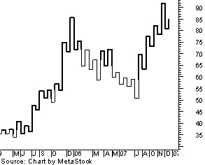 |
| Figure 7 |
Conclusion
Day-to-day price fluctuations can make it extremely difficult for traders in the financial markets to determine the true trend of an asset. Luckily for traders, methods such as kagi charting have helped put an end to focusing on unimportant price moves that do not affect future momentum. At first, a kagi chart can seem like a series of randomly placed lines, but in reality, the movement of each line depends on the price and can be used to generate very profitable trading signals. This charting technique is relatively unknown to mainstream active traders, but given its ability to identify the true trend of an asset, it wouldn't be surprising to see a surge in the number of traders that rely on this chart when making their decisions in the marketplace.
By Casey Murphy,
Access Investopedia's Forex Advisor FREE Report - The 5 Things That Move The Currency Market
Casey Murphy is the senior analyst at ChartAdvisor.com. He contributes educational articles to Investopedia.com and is a graduate of the University of Alberta School of Business. ChartAdvisor is an independent technical analysis service dedicated to uncovering explosive short-term trading opportunities for individual investors. To learn more about how you can start a free trial and put Casey's insightful analysis and expert pattern recognition to work for you, click here now.
No comments:
Post a Comment