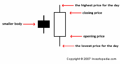
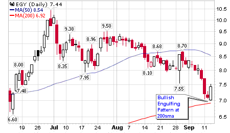
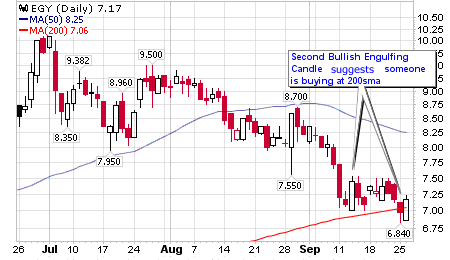
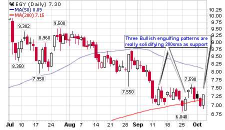
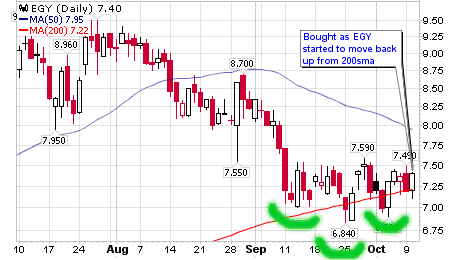
Candlestick charting has become a very popular method for analyzing price charts because many traders feel they are visually more appealing and provide clear signals. Candle patterns are groups of candlesticks that, together, paint the picture of the struggle between market participants. However, a commonly misunderstood aspect to candlestick charting, and specifically candle patterns, is the importance of where a candle pattern forms on a price chart. Some patterns are irrelevant depending on where they occur on a chart, but others can clue in a trader to a major change in trend. Also, by finding common areas on a chart where candle patterns have formed, a trader can identify an area of support or resistance with more accuracy. These areas may simply be a specific price, or they can be derived by traditional Western technical analysis tools, such as trendlines, moving averages or Bollinger bands. A trader can greatly increase his or her odds by locating these areas on the charts where patterns have occurred multiple times.In this article, we'll take a look at an example where a trader took advantage of a specific candle pattern - the bullish engulfing pattern - that occurred near a moving average multiple times. This pattern occurs when price opens below the previous day's candle body and then proceeds to rally and close above it. This action shows that buyers are in control for the day, and that price may be ready to continue higher. When several occurrences of this bullish pattern appear in the same location of a chart, it can provide a valuable clue as to whether that area on the chart will prove to be support or resistance in the future. This tactic may also apply to other patterns, such as a hammer or a morning star. Putting It All TogetherVaalco Energy, Inc. (EGY) was in the process of consolidating a breakout move to all-time highs late in the summer of 2006. As it drifted lower, a bullish engulfing pattern appeared at the rising 200 simple moving average (SMA). Knowing that some institutions and value investors favor buying at the 200 SMA, it seemed possible that the decline would halt in this area, but there was not enough information at this point to conclude a reversal, as this was only one bullish candle following a decline several weeks long. Sure enough, the first pattern didn't follow through. EGY continued to drift lower, and two weeks later, it attempted to break under the 200 SMA. Instead, it found strong buying as witnessed with another bullish engulfing pattern. Figure 2 suggests that someone is buying in this area, but the important thing here is that EGY has a good chance of holding this level. It is still a risky trade, however, as price may trend sideways from this point, even if the decline is over. A few days later, EGY started to fall back below the 200 SMA and buyers returned creating yet another bullish engulfing pattern. After three attempts at declining, EGY still held firm above the 200 SMA. A pattern was beginning to emerge, and it can be seen by observing how buyers are stepping in at the same general location. A few more days pass and EGY begins to dip back under the 200 SMA yet again, and quickly turns higher. While a single candle is usually not enough evidence to make a trading decision, we now have four candles appearing in the same area, greatly increasing the odds that this trade will be successful. At worst, we have a great place to set a low-risk stop-loss order in the event that we are wrong. Setting a stop loss under a group of strong candles is usually a good idea. If EGY falls under the strong candles, then buyers aren't willing to pay that price anymore; therefore, the entire reasoning process for the trade is no longer valid and it's best to exit and reassess the situation. (For more insight, see The Stop-Loss Order - Make Sure You Use It.)The key to this trade is identifying a location where buyers are stepping up, as indicated by the bullish engulfing patterns. I decided to buy based on strong support in this area and in conjunction with other indicators and analysis. | ADVERTISEMENT In this exclusive must-read free report compliments of ChartAdvisor.com you’ll learn 5 of the most reliable chart patterns for delivering explosive and profitable trading ideas. | |
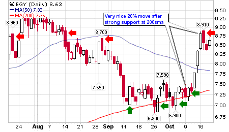
On a side note, you may also see a small inverse head and shoulders with a neckline in the 7.50 range starting to appear in Figure 4, which also solidifies the thought that a bottom is forming at this location. This trade happened to work in my favor as the price quickly moved around 20% in the span of four days. Exiting is another topic altogether, but notice in Figure 5 how several bearish candle patterns continue to appear in the 8.70 area. This was as a good place as any to scale out of the trade. Once you get used to grouping patterns together based on location, it becomes easier to identify potential support or resistance areas. SummaryMuch like in real estate, location is key in candlestick charting. While not all trades work out as well as the one described above, you can't dismiss how clearly the support was defined by grouping three separate candle patterns along a similar location. This tactic is only a small fraction of the trading process, and should only be used in conjunction with a given system. However, the location of a candle pattern is a strong piece of evidence that can be added to a trader's decision-making process. By Joey Fundora,
Access Investopedia's Forex Advisor FREE Report - The 5 Things That Move The Currency Market
Joey Fundora is an independent trader located in South Florida. Joey focuses on using technical analysis techniques to uncover supply and demand imbalances in equities. To see more of his work, visit his downtowntrader site.
No comments:
Post a Comment